Surface Charts
This topic describes how you can view and use surface charts in the Graph panel of the Volatility Surface window.
1. Before you Begin
The Graph panel requires the installation of the Vecmath library. It can be downloaded as part of Java 3D at the following link: http://java3d.java.net/binary-builds.html
You need to add the following jar to the Libraries (Jar files) of the Calypso Installer - "Common Third Party Libraries & Extension":
| • | vecmath.jar |
Ⓘ [NOTE: The Calypso License to use this Calypso integration does not include a license to the actual third-party library - Clients are responsible for contracting with the appropriate third-party provider prior to using this Calypso integration]
2. Graph Panel
The surface chart has two halves: a 3D graph on the left and a line chart on the right. The line chart shows details from the 3D graph.
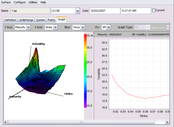
2.1 Axes
Most volatility surfaces have 3 dimensions: maturity, strike and volatility. In such cases, the default setup for the 3D graph has the strike on the x-axis and maturity on the y-axis. Swaption volatility surfaces may have a fourth dimension: the tenor of the underlying swap. The default setup for 4D surfaces has tenor on the x-axis of the graph and maturity on the y-axis.
You can change the axes using the combo-boxes above the graph.
2.2 3D Graph
The 3D graph is divided into colored sections. The color of a section denotes the volatility for the corresponding strike and maturity. The hotter or redder the color, the higher the volatility; the cooler or more blue/violet the color, the lower the volatility.
There may be many strikes for a given tenor and maturity, but the system has to pick one to use for the color setting. By default, this will be the middle strike in the list because this is often the ATM strike. The user can have the colors represent the volatility at a different strike by changing the value of the “Fix” combo box.
2.3 Line Chart
If you click on the 3D graph, a maturity is selected and the line chart on the right will show the volatilities for all the strikes at that maturity (and tenor, where applicable). You can inspect any smile or skew.
The line chart is drawn by interpolating values for 50 evenly spaced strikes. By clicking on the 3D graph, you can see the precise volatility for the closest strike to your mouse position.
On a swaption surface, the line chart will also show points representing the volatilities of the underlying swaptions that were used to generate the surface. (These points will not be shown for a cap surface because the cap surface represents forward volatilities whereas the underlying caps’ quotes are flat volatilities).
To compare the displayed skew with the skew at a second maturity, hold down the Control key and select the other maturity on the 3D graph. A line will be added to the line chart for each selected maturity.